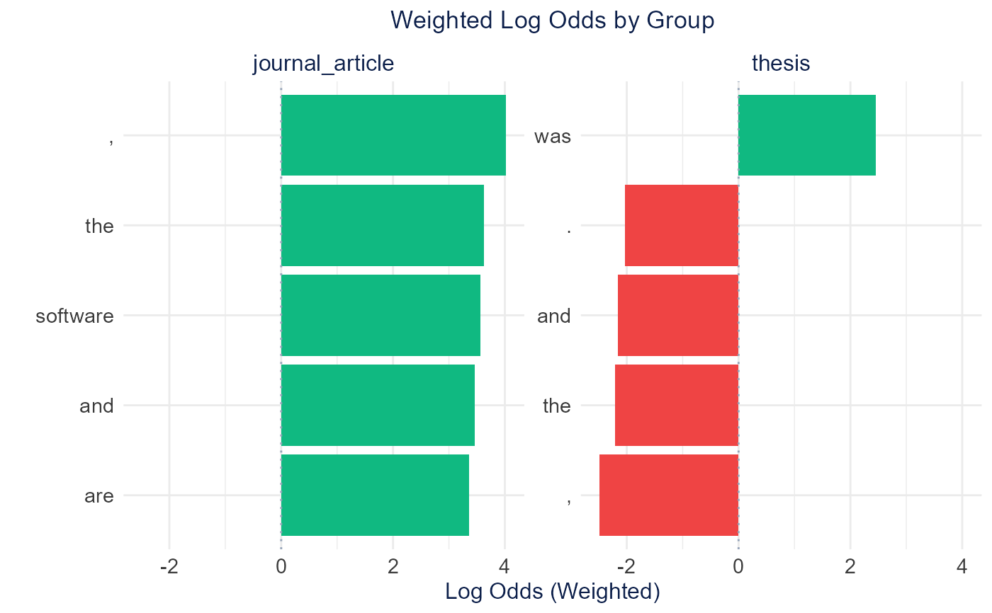
Creates a faceted horizontal bar plot showing weighted log odds for comparing word usage across categories using the Fightin' Words method (Monroe et al. 2008). Each group is displayed in a separate facet showing its most distinctive terms.
Usage
plot_weighted_log_odds(
  weighted_data,
  top_n = 10,
  color_positive = "#10B981",
  color_negative = "#EF4444",
  height = 600,
  width = NULL,
  title = "Weighted Log Odds by Group"
)
Arguments
- weighted_data
Data frame from calculate_weighted_log_odds()
- top_n
Number of top terms to show per group (default: 10)
- color_positive
Color for positive log odds (default: "#10B981" green)
- color_negative
Color for negative log odds (default: "#EF4444" red)
- height
Plot height in pixels (default: 600)
- width
Plot width in pixels (default: NULL for auto)
- title
Plot title (default: "Weighted Log Odds by Group")
Examples
# \donttest{
if (requireNamespace("tidylo", quietly = TRUE)) {
  articles <- TextAnalysisR::SpecialEduTech[1:20, ]
  dfm_object <- quanteda::dfm(quanteda::tokens(articles$abstract))
  quanteda::docvars(dfm_object, "reference_type") <- articles$reference_type
  weighted_odds <- calculate_weighted_log_odds(dfm_object, "reference_type",
                                                top_n = 5)
  plot_weighted_log_odds(weighted_odds)
}

# }
# }