Plot Term Frequency Trends by Continuous Variable
Source:R/lexical_analysis.R
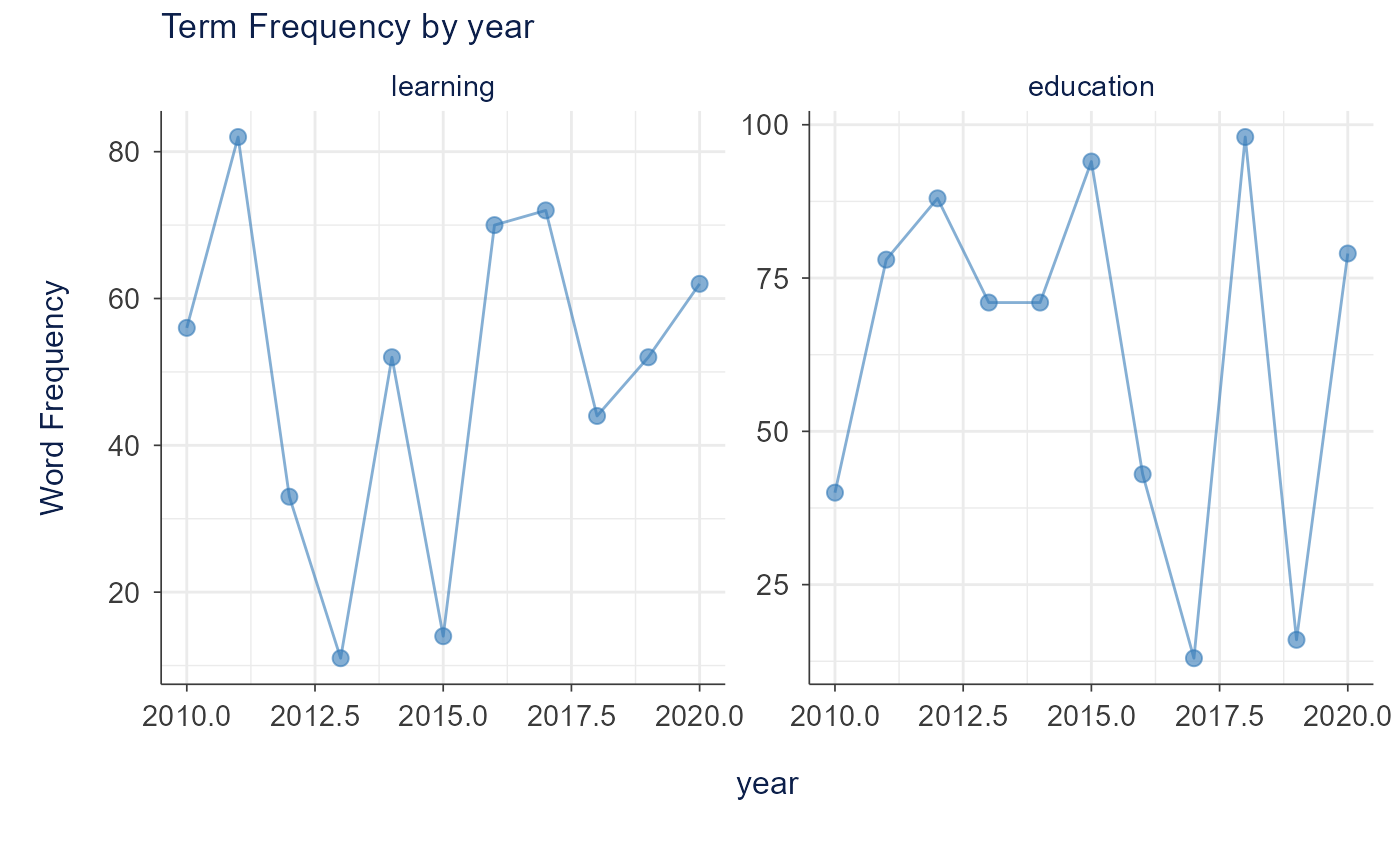
plot_term_trends_continuous.RdCreates a faceted line plot showing how term frequencies vary across a continuous variable (e.g., year, time period).
Usage
plot_term_trends_continuous(
  term_data,
  continuous_var,
  terms = NULL,
  title = NULL,
  height = 600,
  width = NULL
)
Arguments
- term_data
Data frame containing term frequencies with columns: continuous_var, term, and word_frequency
- continuous_var
Name of the continuous variable column
- terms
Character vector of terms to display (optional, filters if provided)
- title
Plot title (default: NULL, auto-generated)
- height
Plot height in pixels (default: 600)
- width
Plot width in pixels (default: NULL, auto)