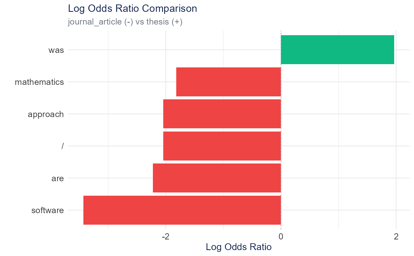
Creates a horizontal bar plot showing log odds ratios for comparing word usage between categories. Positive values indicate higher usage in the first category, negative in the second.
Usage
plot_log_odds_ratio(
  log_odds_data,
  top_n = 10,
  facet_by = NULL,
  color_positive = "#10B981",
  color_negative = "#EF4444",
  height = 600,
  width = NULL,
  title = "Log Odds Ratio Comparison"
)
Arguments
- log_odds_data
Data frame from calculate_log_odds_ratio()
- top_n
Number of top terms to show per direction (default: 10)
- facet_by
Character, column name to facet by (e.g., "category1" for one_vs_rest comparisons). NULL for no faceting.
- color_positive
Color for positive log odds (default: "#10B981" green)
- color_negative
Color for negative log odds (default: "#EF4444" red)
- height
Plot height in pixels (default: 600)
- width
Plot width in pixels (default: NULL for auto)
- title
Plot title (default: "Log Odds Ratio Comparison")
Examples
# \donttest{
articles <- TextAnalysisR::SpecialEduTech[1:20, ]
corpus <- quanteda::corpus(
  articles$abstract,
  docvars = data.frame(reference_type = articles$reference_type)
)
dfm_object <- quanteda::dfm(quanteda::tokens(corpus))
log_odds <- calculate_log_odds_ratio(dfm_object, "reference_type",
                                      comparison_mode = "binary")
plot_log_odds_ratio(log_odds, top_n = 5)

# }
# }