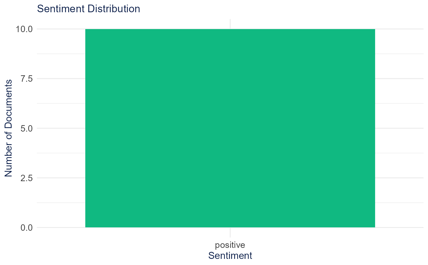
Creates a bar plot showing the distribution of sentiment classifications.
Examples
# \donttest{
abstracts <- TextAnalysisR::SpecialEduTech$abstract[1:10]
sentiment_data <- analyze_sentiment(abstracts)
sentiment_plot <- plot_sentiment_distribution(sentiment_data)
print(sentiment_plot)

# }
# }